 Release Date + About the LaunchEmbrace an ethereal and enchanting summertime ambiance with Viseart Paris as we celebrate our two new magical and luminous neutral Petit Pro palettes Solstice and Midsommer! Our ‘elevated everyday’ essential, eye-enhancing nude shades are empowering not overpowering, giving you simple and delicate control of your work-time to summertime play! Balmy, neutral-toned Petit Pro Solstice with a soft and sumptuous duochrome is our newest core staple and Petit Pro Midsommer is sublimely cool with lyrical, celestial duochrome hues. Our two new summertime palettes offer a refreshing and chic twist on matte and gossamer shades, effortlessly inspiring your refined, sunswept, elegant reverie. Now onlineProducts in the LaunchMidsommer Petit Pro, $30.00Prepare to be bewitched and beguiled by ‘Midsommer’ the magical new Petit Pro! Our ode to those enchanting midsummer evenings enveloped in a dream of love. The puckishly charming Petit Pro Midsommer is a potion of soft cool mattes and gossamer light shimmers worthy of faerie wings! Inspired by the ethereal magic of ‘A Midsummer Nights Dream’ where love, myth and mother nature intertwine, Petit Pro Midsommer will weave its beautiful spell to capture your heart. You’ll be entranced by our spellbinding duochrome ‘Changeling’, bewitched by our delicate and dreamy ‘Faerie’ and captivated by our majestic ‘Titania’ – our passionate and playful Petit Pro Midsommer has 8 beguiling shades to animate your summer dreams!
Solstice Petit Pro, $30.00Petit Pro Solstice is a turning point of ignited shades in a harmonious balance of matte and shimmers! With a rapturous selection of all new earthbound hues, our divine Petit Pro Solstice palette is a bliss of rich, sundrenched colors. Exalt your eyes with the sublime neutral sheen of Solstice – the key to your effortless nude ready-to-wear look! A jubilant new cycle begins as we gather to celebrate transformation, strength, and creativity with four harmonious matte tones, three shimmer shades, and a sumptuous duochrome.

Viseart Midsommer & Solstice Petit Pros for Summer 2020 
Viseart Midsommer & Solstice Petit Pros for Summer 2020 
Viseart Midsommer & Solstice Petit Pros for Summer 2020 
Viseart Midsommer & Solstice Petit Pros for Summer 2020 
Viseart Midsommer & Solstice Petit Pros for Summer 2020 
Viseart Midsommer & Solstice Petit Pros for Summer 2020
Viseart Midsommer & Solstice Petit Pros for Summer 2020
Viseart Midsommer & Solstice Petit Pros for Summer 2020
Viseart Midsommer & Solstice Petit Pros for Summer 2020
Viseart Midsommer & Solstice Petit Pros for Summer 2020
Viseart Midsommer & Solstice Petit Pros for Summer 2020
Viseart Midsommer & Solstice Petit Pros for Summer 2020 via https://www.temptalia.com/viseart-midsommer-solstice-petit-pros-for-summer-2020/
0 Comments
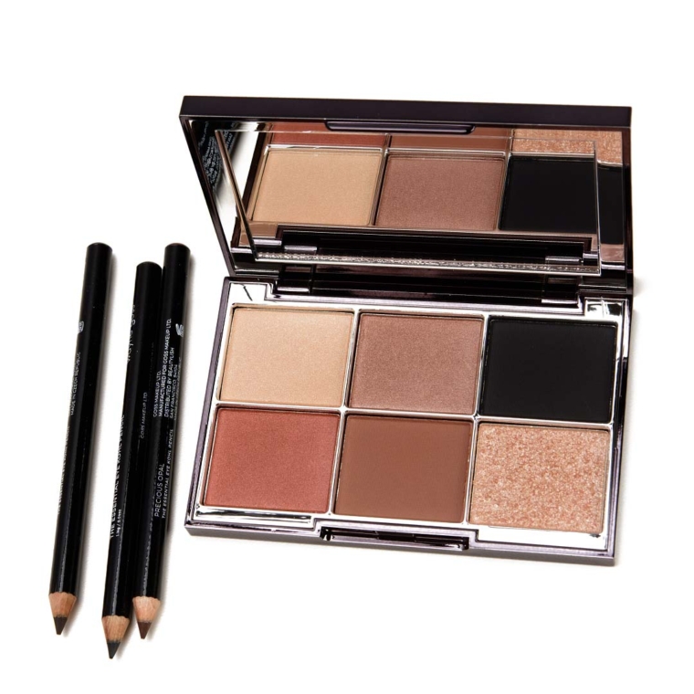 Wayne Goss The Eye Collection debuted this morning (I literally just received these about two hours ago!) and includes a six-pan eyeshadow palette and three eyeliners. Here are swatches! Wayne Goss The Eye Collection
Wayne Goss Imperial Topaz Palette + Eye Kohl Swatches
Wayne Goss Imperial Topaz Palette + Eye Kohl Swatches via https://www.temptalia.com/wayne-goss-imperial-topaz-palette-eye-kohl-swatches/  Hot ShotColour Pop Hot Shot Lux Lip Oil ($8.00 for 0.16 oz.) is a light-medium, caramel brown with warmer undertones and a jelly-like finish that was shiny and translucent. The texture was lightweight, thin, and smooth without any tackiness, so it was comfortable and almost creamy to wear. The pigmentation was sheer, which was as marketed by the brand, so it may look quite different from person to person as the natural lip color will come through a lot. It stayed on well for two hours and moisturizing over time. FURTHER READING: Formula Overview for details on general performance and characteristics (like scent). Top Dupes
Formula Overview$8.00/0.16 oz. - $50.00 Per Ounce The formula is supposed to have a "sheer kiss of colour" that is "nourishing" and "lightweight." It's a creamy, smooth balm-like gloss with moderate shine that is comfortable to apply and to wear. It did have sheer coverage that applied fairly evenly with little to no settling into my lip lines (better than most glosses!). They were hydrating while worn, but they only lasted two hours or less on me, which wasn't unexpected based on the texture (no tackiness and thinner than a longer-wearing lip balm). They had a sweet, almost lemony scent to me with no discernible taste. Browse all of our Colour Pop Lux Lip Oil swatches. IngredientsHydrogenated Polyisobutene, Simmondsia Chinensis (jojoba) Seed Oil, Diisostearyl Malate, Butyrospermum Parkii (shea Butter), Ethylene/propylene/styrene Copolymer, Butylene/ethylene/styrene Copolymer, Flavor, Polyethylene, Microcrystalline Wax, Phenoxyethanol, Silica Dimethyl Silylate, Caprylyl Glycol, Glycine Soja (soybean) Oil, Caprylic/capric Triglyceride, Tocopherol, Hexylene Glycol, Ethylhexylglycerin, Alumina, Saccharin, Calendula Officinalis Flower Extract, Pentaerythrityl Tetra-Di-T-Butyl Hydroxyhydrocinnamate, Chamomilla Recutita (matricaria) Flower Extract; MAY CONTAIN: Bismuth Oxychloride (CI 77163), Blue 1 Lake (CI 42090), Copper Powder (CI 77400), Iron Oxides (CI 77491, CI 77492, CI 77499), Manganese Violet (CI 77742), Mica (CI 77019), Red 6 (CI 15850), Red 7 (CI 15850), Red 7 Lake (CI 15850), Red 27 Lake (CI 45410), Red 28 Lake (CI 45410), Red 28 (CI 45410), Titanium Dioxide (CI 77891), Yellow 5 Lake (CI 19140), Yellow 6 Lake (CI 15985). Hot ShotLELimited Edition. $8.00.
B+
B+
9
Product
10
Pigmentation
9.5
Texture
6.5
Longevity
5
Application
89%
Total
We hope you'll consider supporting Temptalia by shopping through our links below. Thanks!
 BengalColour Pop Bengal Lux Lip Oil ($8.00 for 0.16 oz.) is a medium, pink-coral with moderate, warm undertones and a jelly-like finish–slightly cream-like but translucent and shiny. It delivered sheer coverage as promised, which went on evenly and smoothly across my lips without emphasizing my lip lines; it seemed to smooth some of them out, actually. The texture was lightweight, like a creamy balm, and was comfortable to apply and to wear. The only downside to the formula was it wasn’t particularly long-wearing and would need to be reapplied every two hours or so, though it was moderately hydrating. FURTHER READING: Formula Overview for details on general performance and characteristics (like scent). Top Dupes
Formula Overview$8.00/0.16 oz. - $50.00 Per Ounce The formula is supposed to have a "sheer kiss of colour" that is "nourishing" and "lightweight." It's a creamy, smooth balm-like gloss with moderate shine that is comfortable to apply and to wear. It did have sheer coverage that applied fairly evenly with little to no settling into my lip lines (better than most glosses!). They were hydrating while worn, but they only lasted two hours or less on me, which wasn't unexpected based on the texture (no tackiness and thinner than a longer-wearing lip balm). They had a sweet, almost lemony scent to me with no discernible taste. Browse all of our Colour Pop Lux Lip Oil swatches. IngredientsHydrogenated Polyisobutene, Simmondsia Chinensis (jojoba) Seed Oil, Diisostearyl Malate, Butyrospermum Parkii (shea Butter), Ethylene/propylene/styrene Copolymer, Butylene/ethylene/styrene Copolymer, Flavor, Polyethylene, Microcrystalline Wax, Phenoxyethanol, Silica Dimethyl Silylate, Caprylyl Glycol, Glycine Soja (soybean) Oil, Caprylic/capric Triglyceride, Tocopherol, Hexylene Glycol, Ethylhexylglycerin, Alumina, Saccharin, Calendula Officinalis Flower Extract, Pentaerythrityl Tetra-Di-T-Butyl Hydroxyhydrocinnamate, Chamomilla Recutita (matricaria) Flower Extract; MAY CONTAIN: Bismuth Oxychloride (CI 77163), Blue 1 Lake (CI 42090), Copper Powder (CI 77400), Iron Oxides (CI 77491, CI 77492, CI 77499), Manganese Violet (CI 77742), Mica (CI 77019), Red 6 (CI 15850), Red 7 (CI 15850), Red 7 Lake (CI 15850), Red 27 Lake (CI 45410), Red 28 Lake (CI 45410), Red 28 (CI 45410), Titanium Dioxide (CI 77891), Yellow 5 Lake (CI 19140), Yellow 6 Lake (CI 15985). BengalLELimited Edition. $8.00.
A-
A-
9
Product
10
Pigmentation
10
Texture
6.5
Longevity
5
Application
90%
Total
We hope you'll consider supporting Temptalia by shopping through our links below. Thanks!

Colour Pop Hot Shot Lux Lip Oil 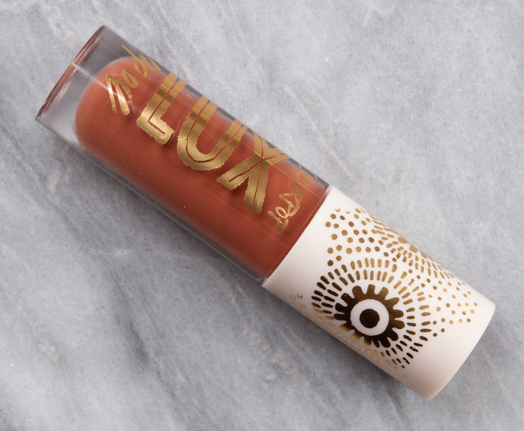
Colour Pop Hot Shot Lux Lip Oil 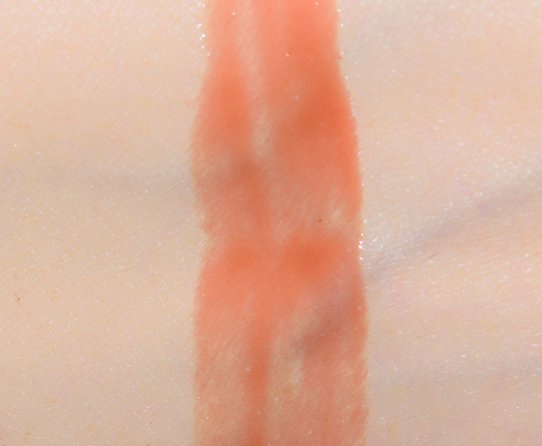
Colour Pop Hot Shot Lux Lip Oil 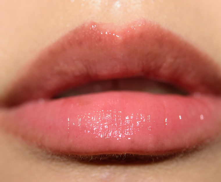
Colour Pop Hot Shot Lux Lip Oil 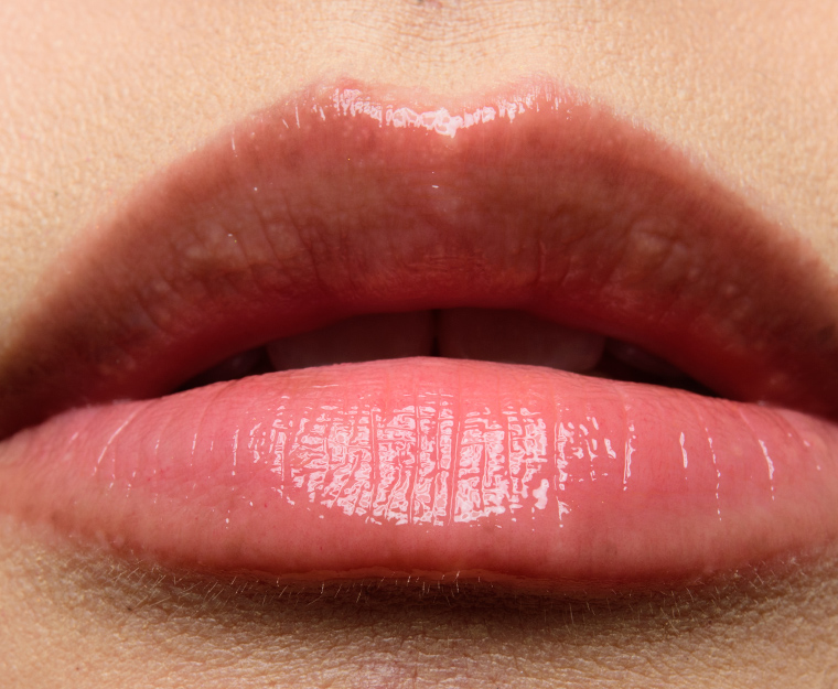
Colour Pop Hot Shot Lux Lip Oil 
Colour Pop Hot Shot Lux Lip Oil 
Colour Pop Bengal Lux Lip Oil 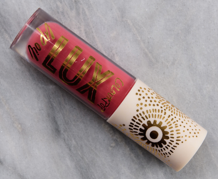
Colour Pop Bengal Lux Lip Oil 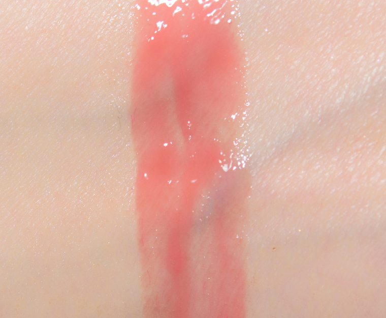
Colour Pop Bengal Lux Lip Oil 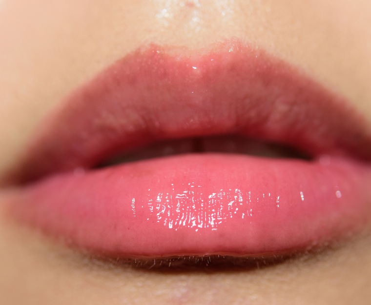
Colour Pop Bengal Lux Lip Oil 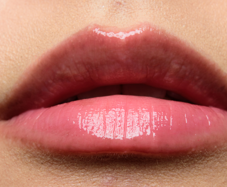
Colour Pop Bengal Lux Lip Oil 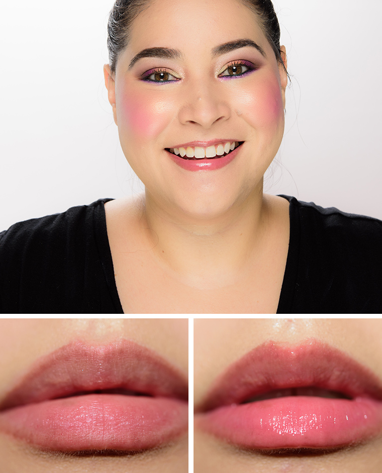
Colour Pop Bengal Lux Lip Oil
Colour Pop Hot Shot Lux Lip Oil
Colour Pop Hot Shot Lux Lip Oil
Colour Pop Hot Shot Lux Lip Oil
Colour Pop Hot Shot Lux Lip Oil
Colour Pop Hot Shot Lux Lip Oil
Colour Pop Hot Shot Lux Lip Oil
Colour Pop Bengal Lux Lip Oil
Colour Pop Bengal Lux Lip Oil
Colour Pop Bengal Lux Lip Oil
Colour Pop Bengal Lux Lip Oil
Colour Pop Bengal Lux Lip Oil
Colour Pop Bengal Lux Lip Oil via https://www.temptalia.com/colourpop-hot-shot-bengal-lux-lip-oils-review-swatches/ After more than two decades, a Denver staple is saying goodbye. Vesta, located in the heart of downtown’s Ballpark neighborhood, announced today it will not re-open. Owner Josh Wolkon explained the pandemic, along with a desire to downsize, are the motivating factors for the decision: “After 23 years, the addition of three restaurants, two food trucks, and a VW bar bus, the current environment is forcing a more focused approach. During this strange moment in time, I’ve enjoyed the bonus time home with my family. In two years, our oldest will be off to college. Two years later, our youngest will follow. I’ve embraced the term ‘right sizing’ which feels appropriate, right now,” he said. 
Photo by Lucy Beaugard. Wolkon also operates Steuben’s and Ace Eat Serve through his restaurant group Secret Sauce. Those locales, with the exception of Steuben’s Arvada location, are currently operational. This marks the first time Secret Sauce has permanently closed a restaurant with Vesta being their original and landmark business. Consequently, the closure is an emotional one: “Vesta brought my wife Jen and me together. We just celebrated 20 years of marriage. Vesta, in many ways, became our identity. We grew up together. Vesta gave us the opportunity to become part of an incredible community and to give back to that community. We were lucky to be one of the restaurants that helped establish Denver’s restaurant renaissance in the late 1990s,” said Wolkon in a letter posted via social media. Originally known as Vesta Dipping Grill, it was hailed for its innovative approach to dining that encouraged patrons to match homemade dipping sauces to a range of proteins. Their embrace of the industrial brick building, and the grittier nature of LoDo back then, only lent itself to their more rebellious spirit. For decades, they anchored the block as developments sprouted on all sides. Even as Denver went through its own restaurant renaissance, Vesta remained a steadfast staple and aimed to adapt with the times, eventually dropping the latter part of its name in favor of a more succinct identity and upscale menu. However, when the pandemic hit, Vesta remained closed with Wolkon focusing on the group’s younger and more casual concepts. 
Vesta’s revamped menu in 2016. Photo by Lucy Beaugard. Regardless of the closure, Vesta’s legacy continues in the culinary world at large as many chefs have cut their teeth in that Blake Street kitchen. Chef Matt Selby — known for his varied culinary endeavors in Denver — was the opening chef, followed by chef Brandon Foster. Foster, who recently passed away, was beloved for his passion in the kitchen and inspirational work with Project Angel Heart. Vesta’s final hurrah, dubbed “Boards for Brandon,” will work to honor his life and support his family after his tragic death. Taking place on August 8 and 9, diners can pick up housemade charcuterie and cheese plates served on keepsake “#BeLikeBrandon” bamboo cutting boards alongside half-price select bottles and cases of wines and spirits from their cellar. The event is especially fitting, as Foster built Vesta’ s charcuterie room. All proceeds will go directly to chef Foster’s family. Click to view slideshow.Unfortunately, there will be no final goodbye party beyond the to-go fundraiser due to COVID-19 restrictions. But the restaurant is encouraging people to share their favorite memories with Vesta by posting stories and photos on their Facebook page. “Vesta’s flame will continue to shine brightly in the soul of the Secret Sauce restaurant group,” concluded Wolkon. “Thank you for giving us opportunities to share so many smiles, memories and joy-filled occasions for more than two decades. It has been a dream come true.” “Boards for Brandon” will take place on August 8 from 10 a.m.-2 p.m. and August 9 from 1 – 5 p.m. at Vesta, 1822 Blake Street Denver. You can go to vestadenver.com for more information on reserving boards and pick up time. via https://303magazine.com/2020/07/vesta-closed-denver/ While the COVID-19 pandemic has challenged many over the past few months — one local street artist wants to help others stay hopeful in the best way she knows how. Koko Bayer is a familiar name within the Denver art scene. While she is a talented street artist that has worked with CRUSH Walls and Meow Wolf — what makes Bayer stand out most is her dedication to the art of wheatpasting. If you have been anywhere in the Denver or Boulder area lately, you may have seen her newest project — also known as Project Spread Hope. The project involves Bayer’s classic wheat paste medium. Earlier this year — when the pandemic began to sweep through the country, Bayer felt motivated to create a project that would inspire others. This is when she created the now-iconic yellow heart with the word “Hope” inside of it — and began wheatpasting these hearts across the Denver area. “As the lockdown started, I found myself pacing around town thinking of ways I could make people feel better,” Bayer said. “After coming up with the idea, I went through the process of designing the print. I wanted to look for a color that would have an emotional effect.” While yellow is known as being a happy color, due to Bayer’s work, it has now become a color of hope to many Denver residents. It seems as if though the hearts can be found around every corner. You may find one in an alleyway, on a window, on a building or even on a dumpster. In fact — Bayer has installed over 200 hope hearts in the Denver area. Another 100 can be found in Summit County. Many of them are over six feet wide. You may find, however, that not all of the hearts are yellow. In early June, Bayer modified her design to include and celebrate both the LGBT community and the Black community. These new hearts feature the Pride Flag designed in 2017 by the Philadelphia Office of LGBT Affairs. This modified version of the traditional pride flag includes black and brown stripes which symbolize people of color within the LGBT community. Bayer then added the colors of the transgender flag at the center of the design. 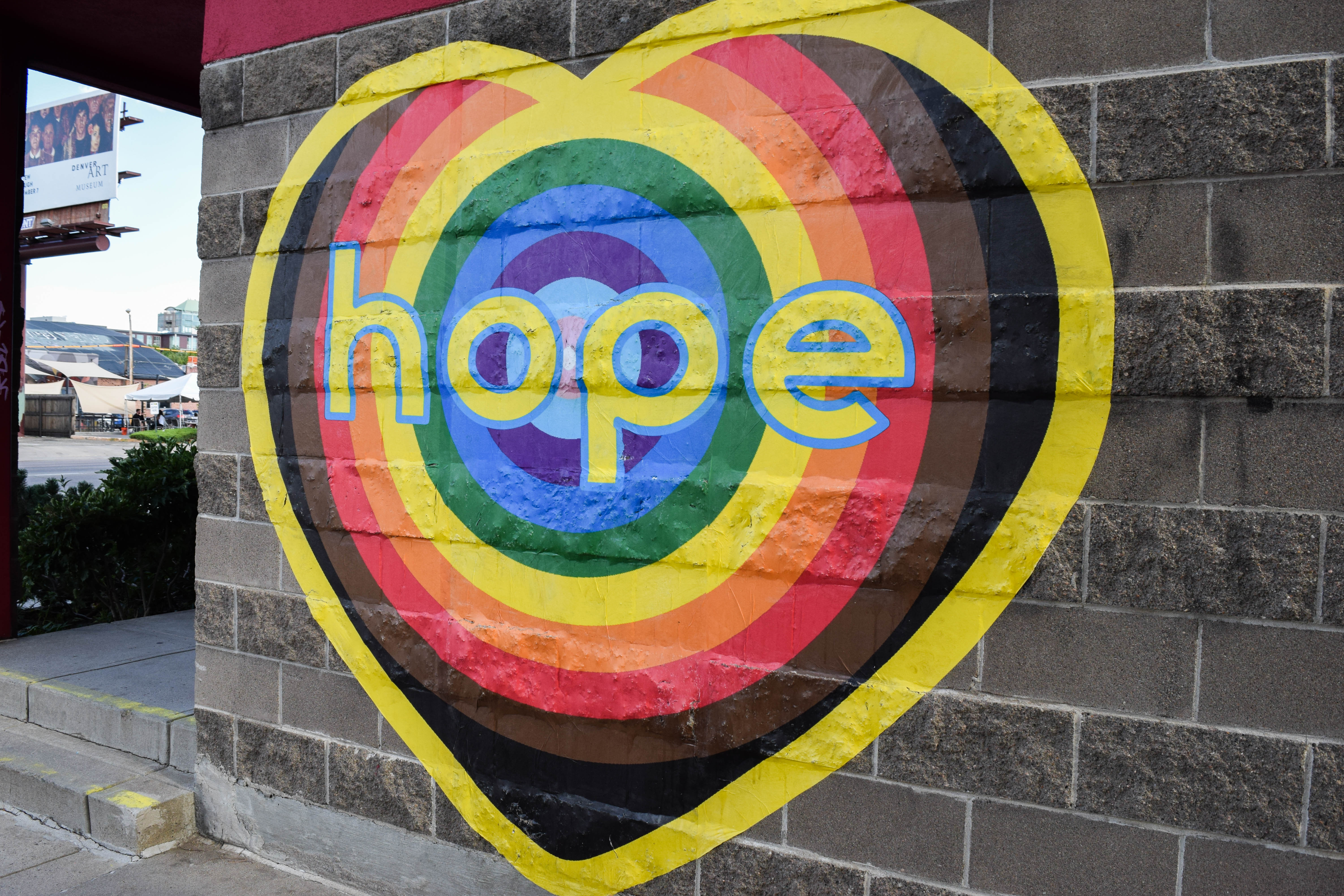
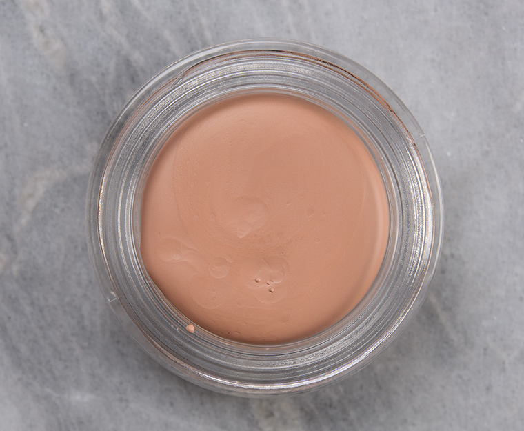
Photo by Barbara Urzua “Each year I do a pride project specifically for Pride Month,” Bayer said. “I decided to incorporate my pride project into Project Spread Hope. The black and brown stripes are there in support of the Black Lives Matter movement.” One of Bayer’s goals when creating art is involving the public and offering chances for them to own her art for free. Bayer has a tradition of dropping off a souvenir nearby each time she pastes a new print. One of her recent souvenirs is titled “yellow and nickel block universal” — which features a design by her step-grandfather and well-known Bauhaus artist Herbert Bayer, titled head + heart + hand. If you stumble upon a freshly pasted print, you might just have a chance at finding one of Bayer’s block souvenirs for yourself. As for the future of this project, Bayer has no plans to stop pasting hearts anytime soon. As long as she has space to paste, these signs of hope will keep popping up around Denver. “This project will go on indefinitely,” Bayer said. “Basically for as long as we need hope.” Bayer shared that the only way this project can continue is if people continue to donate high visibility spots. Property owners who would like to donate space for a heart can do so by contacting Bayer. Donating a space for Bayer to paste on is completely free. Bayer is set to have an exhibition of her works on display at the Denver Botanic Gardens beginning in mid-September and running through December. Her work will also be seen at both the Babe Walls and CRUSH Walls festivals this year. -- You can follow along with and contact Koko Bayer on Instagram. Prints can be downloaded here. Bayer is seeking donations that will go directly toward her print fund. Donations can be made through Venmo @Koko-Bayer. via https://303magazine.com/2020/07/project-spread-hope-hearts-denver/  LaurelColour Pop Laurel Crème Shadow ($8.00 for 0.13 oz.) is a light peach with moderate, warm undertones and a flat, matte finish. It had good color coverage in a single layer, but it was the driest shade in the release of four–even after working away the top layer. It was almost putty-like initially, and while normally, I find the warmth of a fingertip aids in application… this formula merely laughed at my foolishness. Trying to apply this shade with fingertips yielded more product on my fingertip and large patches where product had lifted away because it was both tackier while being dry and clingy. A flat, synthetic brush was better at getting product onto my skin initially, but there was some separation along my crease and finer lines. A fluffy, synthetic brush was better at dispersing the product while laying it down, which made it faster to apply so there was less visible patchiness. Unfortunately, I couldn’t smooth out or find a way around the product getting into my creases/separating along them–it was a lot like a liquid lipstick that “cracks” after it dries down. The product had faded noticeably after six hours of wear on my lid and lasted closer to eight hours on the area above my crease/on my brow bone. FURTHER READING: Formula Overview for details on general performance and characteristics (like scent). Top Dupes
Formula Overview$8.00/0.13 oz. - $61.54 Per Ounce The formula is supposed to be a "primer and shadow in one" that is long-wearing, "crease-proof and water-resistant" that can be used to "even out lid color" or worn "alone for a minimal look" or used under eyeshadow to "intensify color and extend wear." Per the brand, it can be applied with either fingertips or a "larger shade brush." These were a true struggle to work with. I spent one day just trying to find the right way to apply the cream eyeshadows that didn't look like I hadn't had a drop of hydration in 40 years--they made my lids look shriveled, flaky, and emphasized texture I didn't know was there. I had to give up and try again the next day so I didn't abuse my lids beyond repair. The next day, I applied them with the "best" method I could figure out and was astonished by how poorly they wore. The brand's Super Shock Shadows, which is a cream-to-powder formula, wear like iron for me; they typically go on just beautifully and last 10 hours without creasing or fading. This is one of the worst cream eyeshadow formulas I've tried and is one of the few soul-crushing disappointments I've experienced from the brand since its inception. These alternated between sort of drier, stiffer and lightly creamy; the top layer seemed to dry quite quickly--three of the four shades arrived with a drier top layer that became creamier after a second swatch. However, when I went to use them for application and testing on the eyes, that top layer felt a bit drier each time. The formula is fairly quick-drying, though it remained a bit tacky where my lid peeled away from the area above my crease. There was almost no play time at all; I think using fingertips was the absolute worst way to apply these as fingertip application yielded a faster-drying product that applied unevenly, lifted away as it dried down, and almost immediately gathered into creases and accentuated every fine line and bit of texture on my lid without fail. I also felt my fingertips stick a bit with a slight sensation of my lid coming off of my eyeball as I tried to diffuse the product. A flat brush led to marginal improvement; a flat brush delivered more even coverage, but typically a thicker layer, and this is where I noticed more tackiness and where I had the issue of my skin sticking together, which created bald patches where the color stuck and lifted away onto a different part of my eye (e.g. from my lid to above my crease). A fluffy brush was the best tool to use in my experience as it provided a thinner, more even layer of product while simultaneously buffing/diffusing it out, but if you don't blend it out right immediately, there's no forgiveness at all. The product has no ability to endure much blending, rubbing, or faffing or else it flakes off--an accidental rub of the eye will result in an entire bald patch to contend with. It did not take much to flake it all away. I do not recommend layering or building up, and I certainly don't recommend blending two shades together as trying to blend them together resulted in one taking away the other and leaving behind no product at all in the area. I could not keep it from getting into fine lines regardless of the tool I used, and I tried to leave my lid closed for two minutes to let it set more but that did not help. I tried using powder eyeshadow on top, and I felt like most shades "ate" a lot of the color from more matte eyeshadows, so whatever was layered on top looked drier, uneven, and faded. With shimmery eyeshadows, they seemed to apply better but had a more frosted, textured look that wasn't as smooth or as shiny as when worn over bare skin or over a traditional primer. The formula didn't last well on my lids; the lighter shades had started to fade within five hours of wear and two were almost gone within eight hours. They were less prone to fading above the crease area on me (like the brow bone) and there was a decent amount of color still present after eight hours. Browse all of our Colour Pop Crème Shadow swatches. IngredientsIsododecane, Trimethylsiloxysilicate, Synthetic Wax, Cyclopentasiloxane, Dimethicone, Caprylyl Methicone, Triethoxycaprylylsilane, Silica, Phenoxyethanol, BHT, Caprylyl Glycol, Ethylhexylglycerin, Hexylene Glycol, Iron Oxides (CI 77491, CI 77492, CI 77499), Titanium Dioxide (CI 77891). LaurelLELimited Edition. $8.00.
F
F
0.5
Product
9
Pigmentation
1.5
Texture
6
Longevity
1.5
Application
41%
Total
We hope you'll consider supporting Temptalia by shopping through our links below. Thanks!
 MoonbeamColour Pop Moonbeam Crème Shadow ($8.00 for 0.13 oz.) is a medium brown with moderate, warm undertones and a flat, matte finish. This shade had a creamier feel initially than other shades when I first tried it, but subsequent uses revealed that it had a similar tendency to be firmer and drier on the surface and slightly creamier beneath it after each use. The formula was more challenging to work with, but this was one of the “better” shades, though not by much and not something I’d want to test out again. It had opaque color coverage and applied decently with a flat, synthetic brush but separated along fine lines and caught on texture, especially as it dried down or if I attempted to layer anything over it. The product started to flake away and leave behind bald patches in its wake. I still wouldn’t bother with fingertips as the formula dried down too quickly and wasn’t blendable or spreadable almost immediately after the product was applied to my skin when I used my fingers. If I attempted to blend/spread, the product lifted away entirely. A fluffy brush remained the best tool to get more even, diffused edges without risking total patchiness to get there. The dry down was quick, so you’ll want to work very quickly and go for more minimal blending. It did not seem to apply better as a thin layer; I had a bit less noticeable creasing with a thinner layer but more patchiness, whereas a more medium layer (not heavy! but more opaque) had less patchiness but pulled away fine lines/creases and clung to texture (that I honestly couldn’t see in person… and wasn’t there when I applied another cream eyeshadow later on to check if it was really just a nightmare). This one lasted longer than other shades; the creasing didn’t seem to worsen until after seven hours of wear and started to fade noticeably after eight hours of wear. It was flaking to begin with, though, and there was some additional flaking over time. FURTHER READING: Formula Overview for details on general performance and characteristics (like scent). Top Dupes
Formula Overview$8.00/0.13 oz. - $61.54 Per Ounce The formula is supposed to be a "primer and shadow in one" that is long-wearing, "crease-proof and water-resistant" that can be used to "even out lid color" or worn "alone for a minimal look" or used under eyeshadow to "intensify color and extend wear." Per the brand, it can be applied with either fingertips or a "larger shade brush." These were a true struggle to work with. I spent one day just trying to find the right way to apply the cream eyeshadows that didn't look like I hadn't had a drop of hydration in 40 years--they made my lids look shriveled, flaky, and emphasized texture I didn't know was there. I had to give up and try again the next day so I didn't abuse my lids beyond repair. The next day, I applied them with the "best" method I could figure out and was astonished by how poorly they wore. The brand's Super Shock Shadows, which is a cream-to-powder formula, wear like iron for me; they typically go on just beautifully and last 10 hours without creasing or fading. This is one of the worst cream eyeshadow formulas I've tried and is one of the few soul-crushing disappointments I've experienced from the brand since its inception. These alternated between sort of drier, stiffer and lightly creamy; the top layer seemed to dry quite quickly--three of the four shades arrived with a drier top layer that became creamier after a second swatch. However, when I went to use them for application and testing on the eyes, that top layer felt a bit drier each time. The formula is fairly quick-drying, though it remained a bit tacky where my lid peeled away from the area above my crease. There was almost no play time at all; I think using fingertips was the absolute worst way to apply these as fingertip application yielded a faster-drying product that applied unevenly, lifted away as it dried down, and almost immediately gathered into creases and accentuated every fine line and bit of texture on my lid without fail. I also felt my fingertips stick a bit with a slight sensation of my lid coming off of my eyeball as I tried to diffuse the product. A flat brush led to marginal improvement; a flat brush delivered more even coverage, but typically a thicker layer, and this is where I noticed more tackiness and where I had the issue of my skin sticking together, which created bald patches where the color stuck and lifted away onto a different part of my eye (e.g. from my lid to above my crease). A fluffy brush was the best tool to use in my experience as it provided a thinner, more even layer of product while simultaneously buffing/diffusing it out, but if you don't blend it out right immediately, there's no forgiveness at all. The product has no ability to endure much blending, rubbing, or faffing or else it flakes off--an accidental rub of the eye will result in an entire bald patch to contend with. It did not take much to flake it all away. I do not recommend layering or building up, and I certainly don't recommend blending two shades together as trying to blend them together resulted in one taking away the other and leaving behind no product at all in the area. I could not keep it from getting into fine lines regardless of the tool I used, and I tried to leave my lid closed for two minutes to let it set more but that did not help. I tried using powder eyeshadow on top, and I felt like most shades "ate" a lot of the color from more matte eyeshadows, so whatever was layered on top looked drier, uneven, and faded. With shimmery eyeshadows, they seemed to apply better but had a more frosted, textured look that wasn't as smooth or as shiny as when worn over bare skin or over a traditional primer. The formula didn't last well on my lids; the lighter shades had started to fade within five hours of wear and two were almost gone within eight hours. They were less prone to fading above the crease area on me (like the brow bone) and there was a decent amount of color still present after eight hours. Browse all of our Colour Pop Crème Shadow swatches. IngredientsIsododecane, Trimethylsiloxysilicate, Synthetic Wax, Cyclopentasiloxane, Dimethicone, Caprylyl Methicone, Triethoxycaprylylsilane, Silica, Phenoxyethanol, BHT, Caprylyl Glycol, Ethylhexylglycerin, Hexylene Glycol, Iron Oxides (CI 77491,CI 77492, CI 77499), Titanium Dioxide (CI 77891). MoonbeamLELimited Edition. $8.00.
F
F
2
Product
10
Pigmentation
6
Texture
6
Longevity
2
Application
58%
Total
We hope you'll consider supporting Temptalia by shopping through our links below. Thanks!
Colour Pop Laurel Crème Shadow 
Colour Pop Laurel Crème Shadow 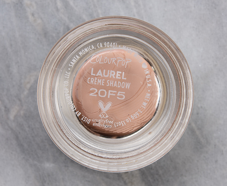
Colour Pop Laurel Crème Shadow 
Colour Pop Laurel Crème Shadow 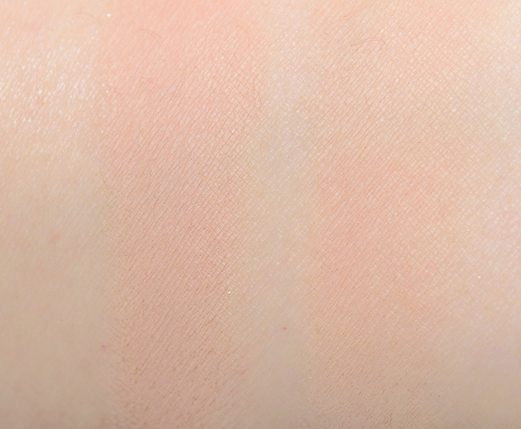
Colour Pop Laurel Crème Shadow 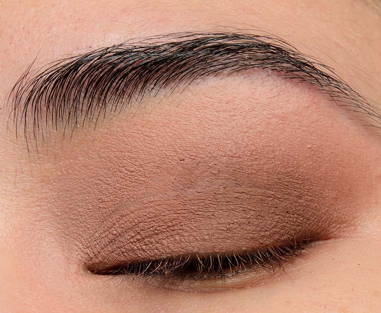
ColourPop Laurel + Moonbeam -- 15 Minutes After Application 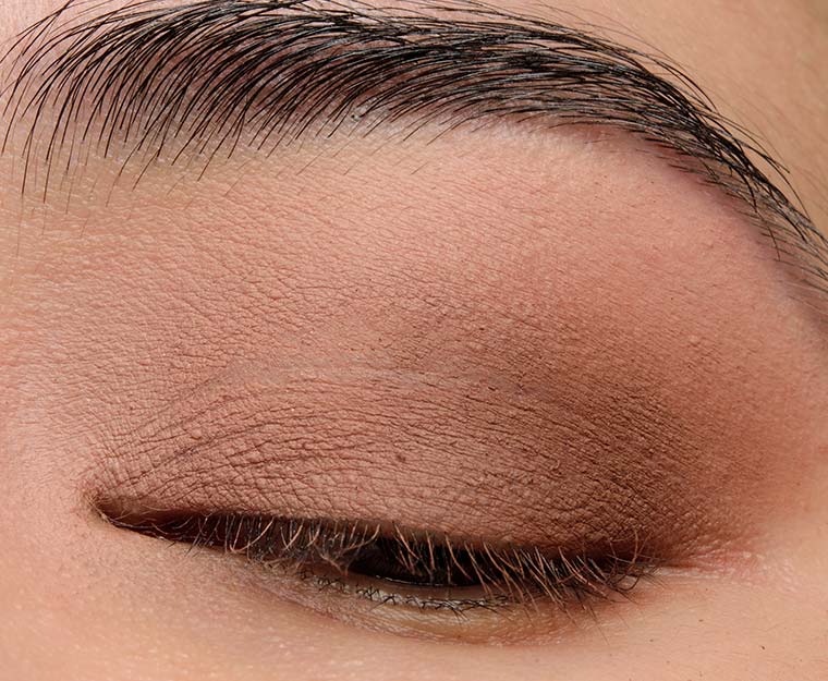
ColourPop Laurel + Moonbeam -- 15 Minutes After Application 
Colour Pop Moonbeam Crème Shadow 
Colour Pop Moonbeam Crème Shadow 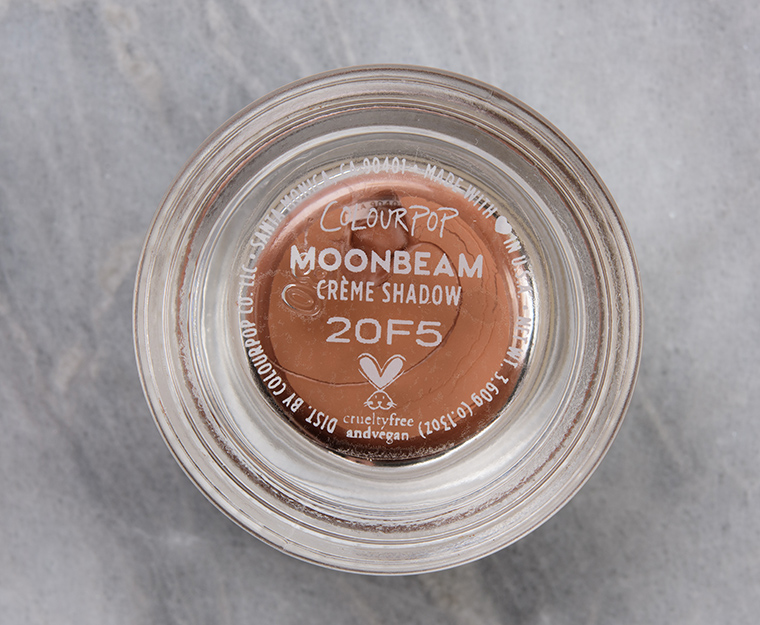
Colour Pop Moonbeam Crème Shadow 
Colour Pop Moonbeam Crème Shadow 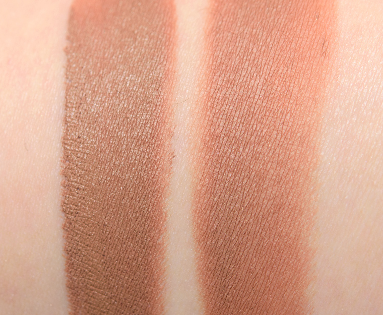
Colour Pop Moonbeam Crème Shadow
Colour Pop Laurel Crème Shadow
Colour Pop Laurel Crème Shadow
Colour Pop Laurel Crème Shadow
Colour Pop Laurel Crème Shadow
Colour Pop Laurel Crème Shadow
ColourPop Laurel + Moonbeam -- 15 Minutes After Application
ColourPop Laurel + Moonbeam -- 15 Minutes After Application
Colour Pop Moonbeam Crème Shadow
Colour Pop Moonbeam Crème Shadow
Colour Pop Moonbeam Crème Shadow
Colour Pop Moonbeam Crème Shadow
Colour Pop Moonbeam Crème Shadow via https://www.temptalia.com/colourpop-laurel-moonbeam-creme-shadows-reviews-swatches/  WayfarerColour Pop Wayfarer Pressed Powder Blush ($10.00 for 0.13 oz.) is a light orange with warmer, yellow undertones and flecks of gold micro-sparkle over a more satin finish. It had semi-sheer, buildable coverage–which it was supposed to have!–that had a moderately powdery consistency in the pan, though it felt more finely-milled and softer than it appeared swatched. The powder applied evenly to bare skin and blended out nicely along the edges with a few random micro-sparkles that were visible. It wore well for eight hours on me before fading noticeably. FURTHER READING: Formula Overview for details on general performance and characteristics (like scent). Top Dupes
Formula Overview$10.00/0.13 oz. - $76.92 Per Ounce The formula is supposed to go on "smoothly" and have a "natural and healthy flush" that has "long wear" and "can be layered to your desired intensity." It is a lightly to moderately powdery powder blush with semi-sheer to semi-opaque, buildable color payoff. The consistency has a drier, thinner feel and though it feels silky to the touch, I found it the type of powder blush can be tricky to blend out evenly on the skin, depending on one's skin type or base preferences. The drier the skin/base, the better the formula would blend, but any natural oils or slip caused the blush to go on unevenly and was difficult to blend out. The wear was between seven and eight hours on me on average. Browse all of our Colour Pop Pressed Powder Blush swatches. IngredientsTalc, Boron Nitride, Nylon-12, Synthetic Fluorphlogopite, Magnesium Stearate, Hydrogenated Polyisobutene, Ethylhexyl Palmitate, Zinc Stearate, Calcium Sodium Borosilicate, Distarch Phosphate, Hydrolyzed Theobroma Cacao (cocoa) Seed Butter, Phenoxyethanol, Dimethicone, Caprylyl Glycol, Octocrylene, Butyrospermum Parkii (shea) Butter, Ethylhexylglycerin, Hexylene Glycol, Tin Oxide, Tocopheryl Acetate, Quercetin, Bismuth Oxychloride (CI 77163), Iron Oxides (CI 77492, CI 77499), Mica (CI 77019), Red 40 Lake (CI 16035), Titanium Dioxide (CI 77891), Yellow 5 Lake (CI 19140). WayfarerLELimited Edition. $10.00.
A-
A-
8.5
Product
10
Pigmentation
8.5
Texture
8.5
Longevity
5
Application
90%
Total
We hope you'll consider supporting Temptalia by shopping through our links below. Thanks!


Colour Pop Wayfarer Pressed Powder Blush 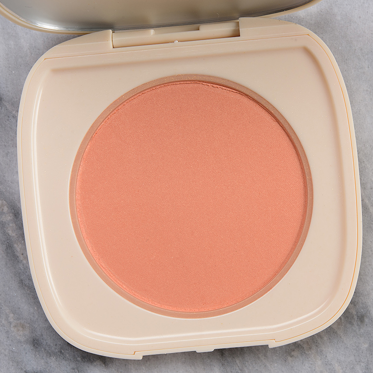
Colour Pop Wayfarer Pressed Powder Blush 
Colour Pop Wayfarer Pressed Powder Blush 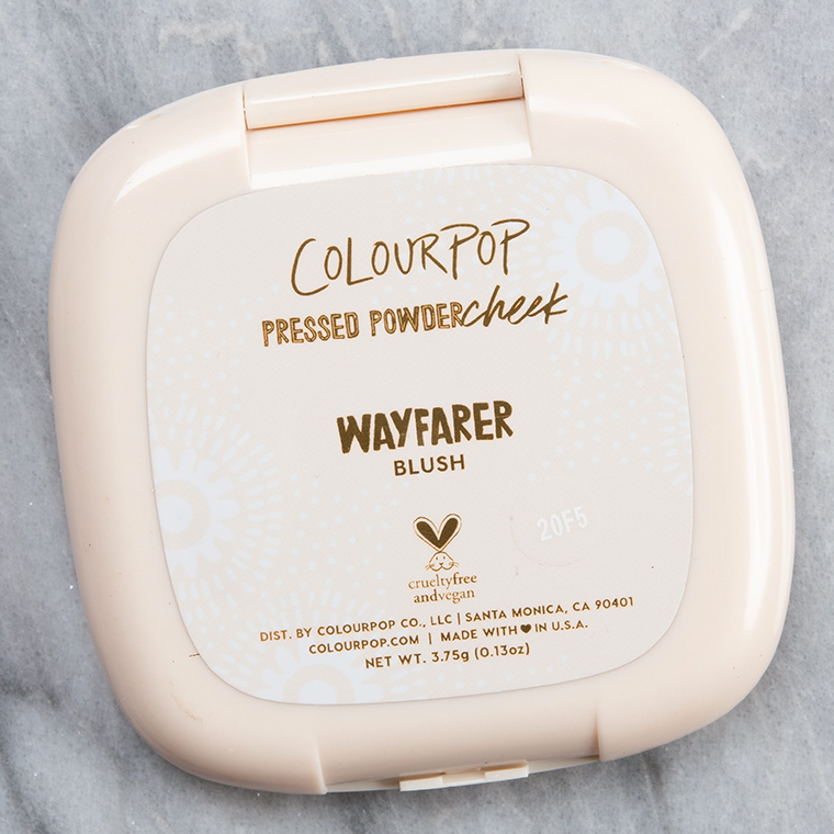
Colour Pop Wayfarer Pressed Powder Blush 
Colour Pop Wayfarer Pressed Powder Blush 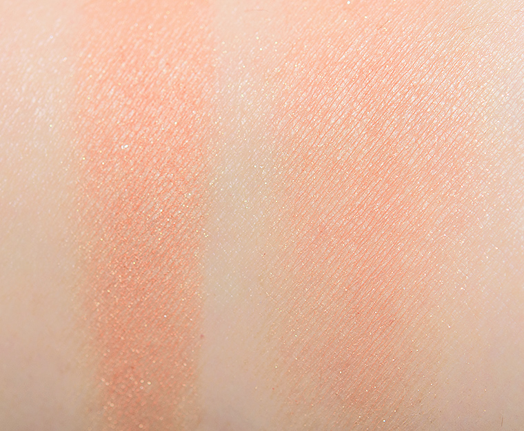
Colour Pop Wayfarer Pressed Powder Blush 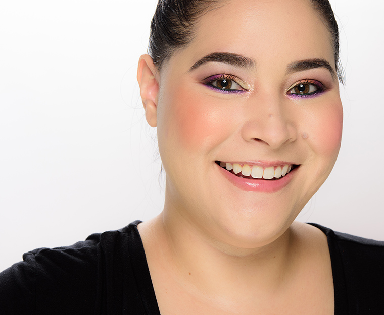
Colour Pop Wayfarer Pressed Powder Blush 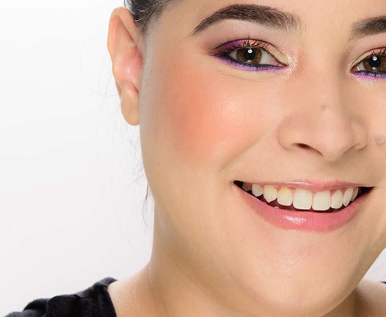
Colour Pop Wayfarer Pressed Powder Blush
Colour Pop Wayfarer Pressed Powder Blush
Colour Pop Wayfarer Pressed Powder Blush
Colour Pop Wayfarer Pressed Powder Blush
Colour Pop Wayfarer Pressed Powder Blush
Colour Pop Wayfarer Pressed Powder Blush
Colour Pop Wayfarer Pressed Powder Blush
Colour Pop Wayfarer Pressed Powder Blush
Colour Pop Wayfarer Pressed Powder Blush via https://www.temptalia.com/colourpop-wayfarer-pressed-powder-blush-review-swatches/  On the HorizonColour Pop On the Horizon Pressed Powder Blush ($10.00 for 0.13 oz.) is a brighter, medium pink with strong, warm undertones and flecks of gold micro-sparkle over a more semi-matte finish. It had buildable coverage from medium to mostly opaque, while the texture felt soft, yielding, and was lightly powdery in the pan but didn’t appear dry or powdery when applied to my skin. The blush applied evenly and blended out without difficulty along the edges. There were visible gold sparkles on my cheeks that had more of a random pattern, so anyone who loathes “glittery” blushes will likely want to give this a miss–there were enough particles to actually translate. It stayed on nicely for eight hours before fading noticeably. FURTHER READING: Formula Overview for details on general performance and characteristics (like scent). Top Dupes
Formula Overview$10.00/0.13 oz. - $76.92 Per Ounce The formula is supposed to go on "smoothly" and have a "natural and healthy flush" that has "long wear" and "can be layered to your desired intensity." It is a lightly to moderately powdery powder blush with semi-sheer to semi-opaque, buildable color payoff. The consistency has a drier, thinner feel and though it feels silky to the touch, I found it the type of powder blush can be tricky to blend out evenly on the skin, depending on one's skin type or base preferences. The drier the skin/base, the better the formula would blend, but any natural oils or slip caused the blush to go on unevenly and was difficult to blend out. The wear was between seven and eight hours on me on average. Browse all of our Colour Pop Pressed Powder Blush swatches. IngredientsTalc, Boron Nitride, Nylon-12, Synthetic Fluorphlogopite, Magnesium Stearate, Hydrogenated Polyisobutene, Ethylhexyl Palmitate, Zinc Stearate, Calcium Sodium Borosilicate, Distarch Phosphate, Hydrolyzed Theobroma Cacao (cocoa) Seed Butter, Phenoxyethanol, Dimethicone, Caprylyl Glycol, Octocrylene, Butyrospermum Parkii (shea) Butter, Ethylhexylglycerin, Hexylene Glycol, Tin Oxide, Tocopheryl Acetate, Quercetin, Bismuth Oxychloride (CI 77163), Iron Oxides (CI 77492, CI 77499), Mica (CI 77019), Red 6 (CI 15850), Red 7 Lake (CI 15850), Red 40 Lake (CI 16035), Titanium Dioxide (CI 77891). On the HorizonLELimited Edition. $10.00.
A-
A-
8.5
Product
10
Pigmentation
8.5
Texture
8.5
Longevity
5
Application
90%
Total

Colour Pop On the Horizon Pressed Powder Blush 
Colour Pop On the Horizon Pressed Powder Blush 
Colour Pop On the Horizon Pressed Powder Blush 
Colour Pop On the Horizon Pressed Powder Blush 
Colour Pop On the Horizon Pressed Powder Blush 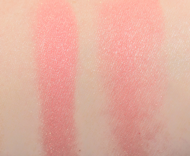
Colour Pop On the Horizon Pressed Powder Blush 
Colour Pop On the Horizon Pressed Powder Blush 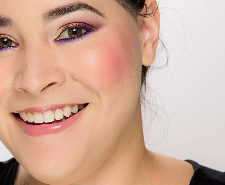
Colour Pop On the Horizon Pressed Powder Blush
Colour Pop On the Horizon Pressed Powder Blush
Colour Pop On the Horizon Pressed Powder Blush
Colour Pop On the Horizon Pressed Powder Blush
Colour Pop On the Horizon Pressed Powder Blush
Colour Pop On the Horizon Pressed Powder Blush
Colour Pop On the Horizon Pressed Powder Blush
Colour Pop On the Horizon Pressed Powder Blush
Colour Pop On the Horizon Pressed Powder Blush via https://www.temptalia.com/colourpop-on-the-horizon-pressed-powder-blush-review-swatches/ Happy Wednesday! Here's this week's survey, which you can copy and paste and share as a comment.
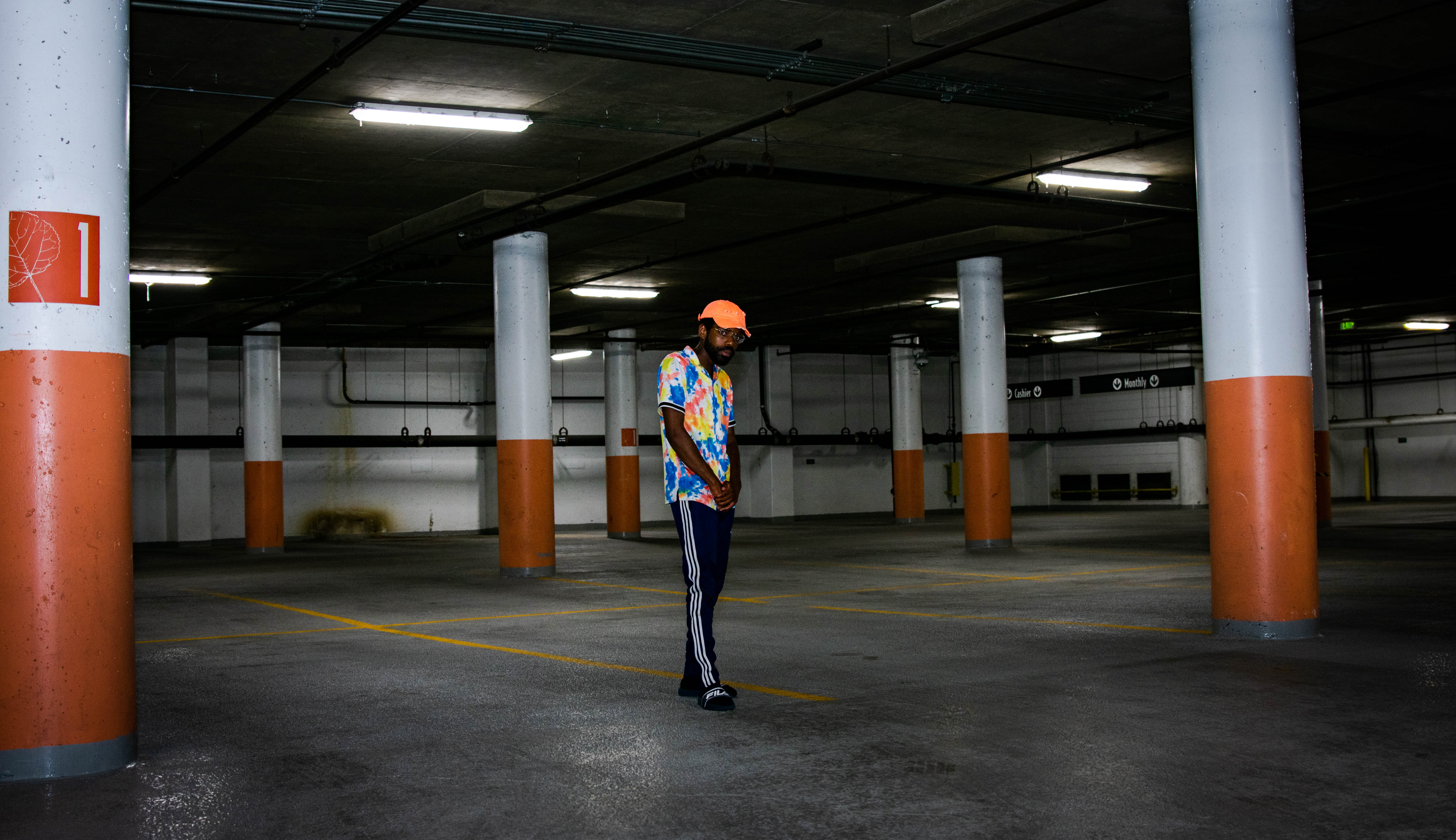
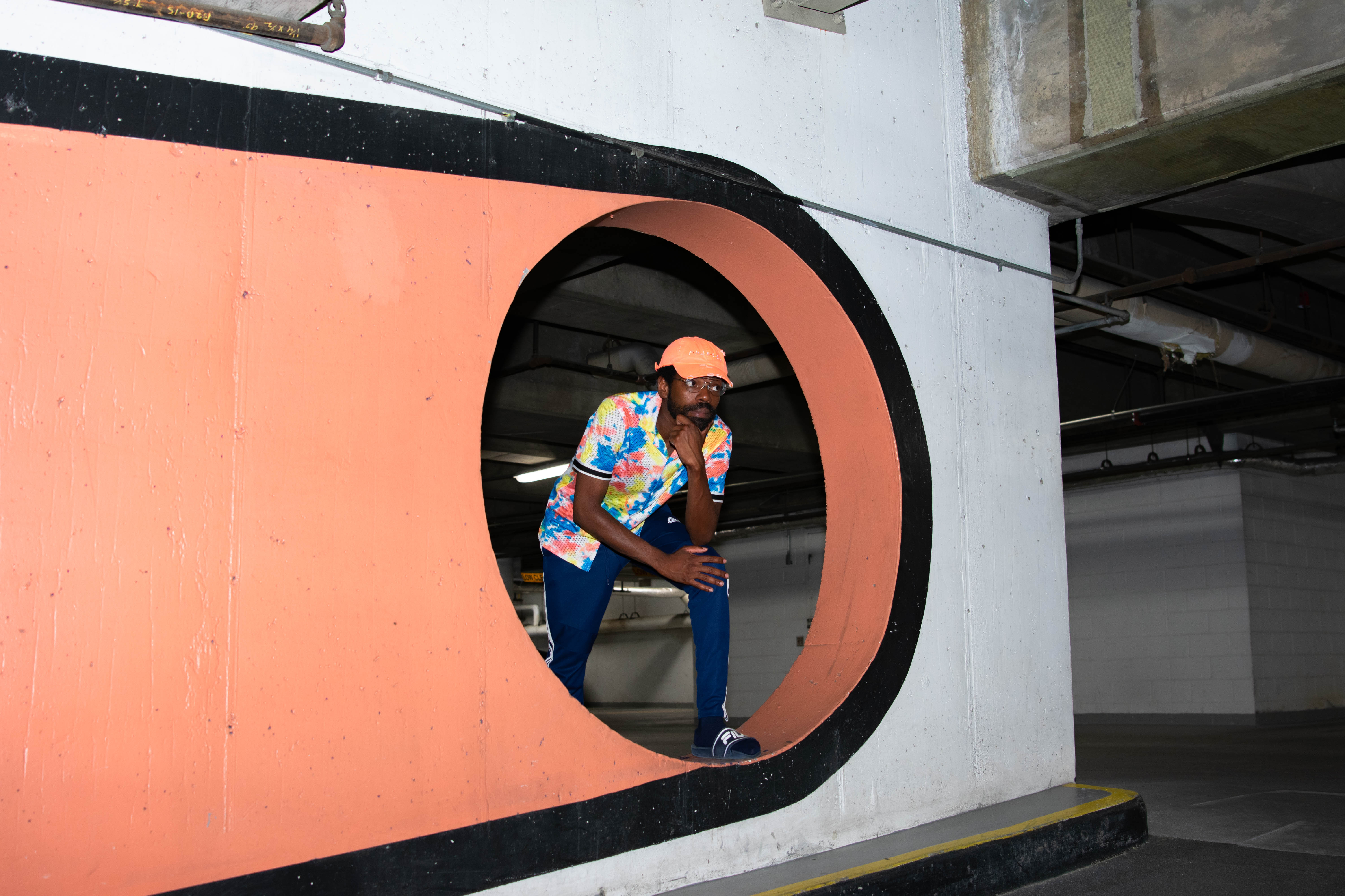
via https://www.temptalia.com/survey-says-july-29th-2020/ The subject line read “Re: Best Indie Rapper in Denver,” a played out hyperbole that almost always fails to live up to whatever questionable content comes attached. However, this one was different. The email, offering the introduction of an unsung Schama Noel, was almost destined for the trash bin up until the stuttering sample and wayfaring wordplay of “What’s Happening Now” whisked him to redemption. The song which laments lost love in pursuit of generational success and one’s destiny is conscious rap in the context of modern hip-hop movements, and one hell of an introduction. With a unique voice and an unmistakable style, Schama Noel’s claims may just have credence. Born in Port Au Prince, Haiti to two conservative Christian parents, Noel’s rap aspirations were nearly dead on arrival. Despite his adamance on not cursing and staying away from sexually explicit material, Noel still couldn’t get his parent’s blessing nor their blind eye. Yet Noel continued onward in secret, filling his teenage years with poetry that evolved into voracious flows that have established him as the artist he is today. Only when he received an invite to perform in Dubai in 2015 did his parents change their tune and finally begin to see his merits. Noel initially gained a viral profile on Twitter with RapLike, an account dedicated to emulating some of the biggest rappers in the world. He then moved from Orlando, Florida to Denver, where his own music has rapidly tapped into a large audience. Through it all, Schama Noel has hit his stride. “I want my music to be appropriate for all ages,” Noel said over the phone. “I want you to be able to play it out at a barbecue at church or the clubs simultaneously. I kind of give off those vibes, you don’t have to turn my music off when kids are in the room, you know — I try to make sure it’s as E-rated as possible and innovative — to mix different things and just be unpredictable.”
While such an admission to innocence may seem curious, Noel represents a type of lyricism that harkens back to the early days of hip-hop, where clever wordplay took precedence over curses. Not only does Noel see it as an attribute to his upbringing, he sees it as proof in the power of his “pen game:” “I think being raised in a Christian home with those values definitely pushed me towards that direction, but also it’s almost like a test of my pen game and my integrity as an artist to just be known for having music that’s genuine and pure. I think that alone transcends anything that I could do. I just made it my goal to always have this type of righteousness and it’s associated with my music,” said Noel.
|
About UsHello Colorado friends. I hope you are having a lovely day! Smile bright and keep moving forward. Archives
November 2020
Categories |


 RSS Feed
